Packaging Material Supply Perspective
Reference Standard: Relevant material and performance standards include ASTM D1693 for PE environmental stress-cracking evaluation and ISO 9001:2015 for quality management discipline. These references support validation logic, but the article angle here is not a laboratory testing story; it is a packaging readability and recognition perspective for real consumer use.
Short Answer
When the Bottle Is Read Like a Consumer Instruction Surface, Not Just a Container
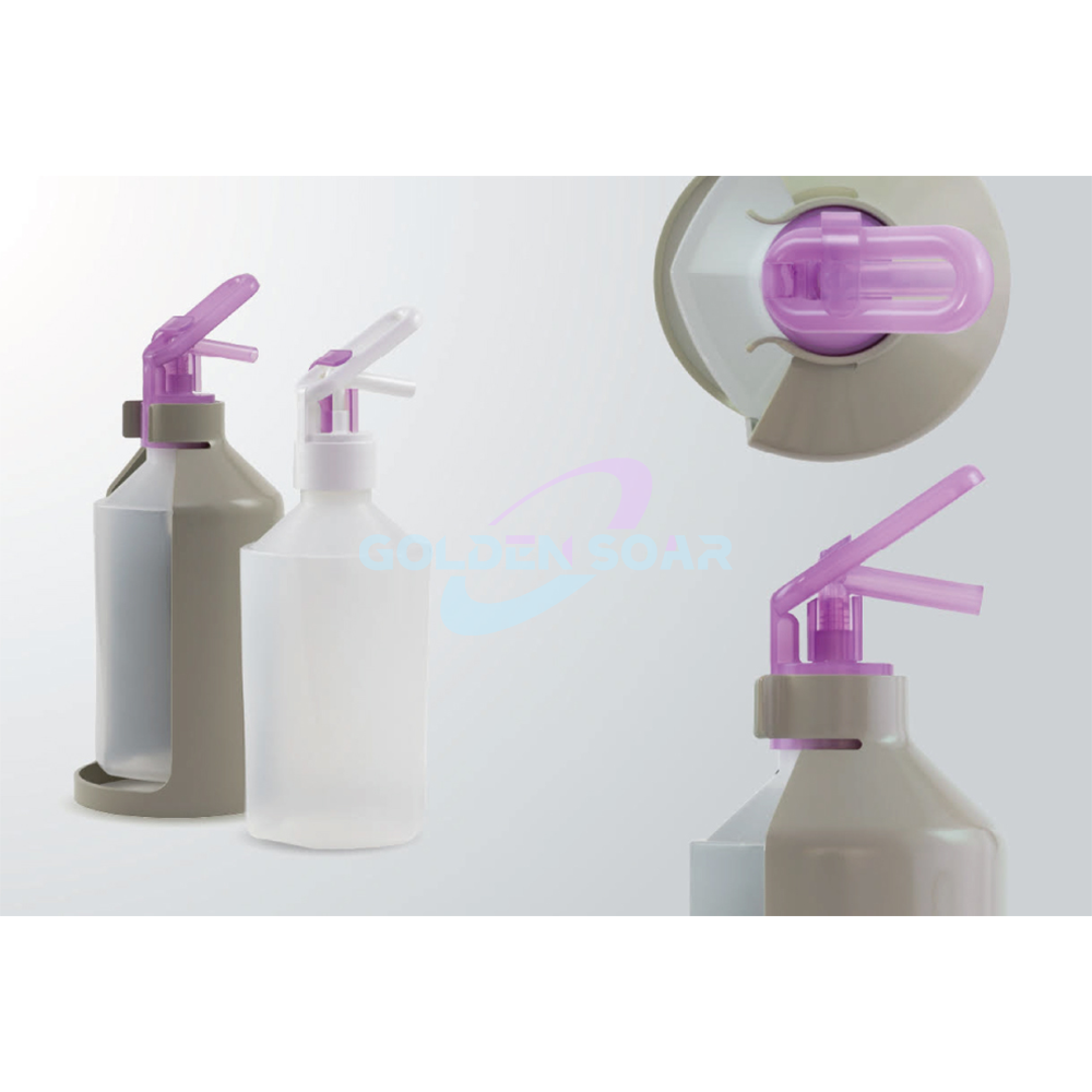
A bottle is often treated as a molded object first and an instruction surface second. That order can be risky. In consumer-facing packaging, the user may never read a long back label before pressing the pump, squeezing the body, opening the cap, or replacing the refill cartridge. The first readable signals are usually physical: capacity mark, cap direction, pump shape, fill-level cue, front-back orientation, and whether the container looks refillable or disposable. For packaging material supply, this means a 150ml PE travel squeeze bottle, a 120ml PE lotion bottle, a 350ml PE foam pump bottle, a 300ml+300ml PE dual chamber bottle, and a 420ml recommended refill airless system should be evaluated as instruction carriers, not just resin containers.
The material data changes how those instructions behave. PE can be soft and squeezable, especially in small travel formats. A 150ml PE travel squeeze bottle with 18g weight and 57mm44mm160mm specification has limited surface area, so every icon competes with the brand name, capacity, ingredient label, and opening direction. A 120ml PE lotion bottle with 15g weight and 48mm48mm101mm specification is even more compressed. If a dosage mark is placed too close to a curved edge, the user may read it at an angle. If an open-close arrow is placed on a cap that is often handled with wet fingers, the mark must be positioned where the eye naturally searches before force is applied.
An edge-case model helps explain the risk. Imagine a small refillable lotion bottle used in a hotel bathroom, carried in a travel kit, then refilled at home. In the early stage, the label is clean, the pump direction is visible, and the fill level is easy to judge. In the middle stage, the bottle surface becomes visually crowded: water droplets, residue, and hand contact reduce contrast. In the stress stage, the consumer does not compare technical specifications; they guess. A wrong guess may mean pressing the foam pump as if it were a lotion pump, using too much product, storing the bottle upside down, or discarding a refillable unit because the refill cue was not obvious.
The cross-dimensional comparison is simple: a 350ml PE foam pump bottle with PE body and PP pump head communicates function through the pump silhouette, while a 300ml+300ml dual chamber bottle communicates function through body geometry. The foam pump tells the user “press here.” The dual chamber tells the user “two products live here.” If the symbol system does not support that physical message, the body design loses part of its value. A child-facing package adds another layer. A cute shape may attract attention, but the icon must still separate playfulness from dosage control. That is why packaging readability should be reviewed before decoration is finalized, especially on PE and PP structures where cap, pump, and bottle body may be different materials.
KEY TAKEAWAYS
- A small PE bottle can be structurally correct but still fail if dosage and refill cues are visually crowded.
- Pump shape, cap direction, and fill-level marks should be reviewed as one instruction system.
- Child-facing graphics must not hide use direction, capacity recognition, or refill identity.
Two-Language Labels Can Fail Before the Formula Fails
Export packaging often fails in a quiet way: not because the formula reacts with the resin, but because the user cannot interpret the package fast enough. Two-language labels are not simply translations. They must survive curved bottle surfaces, pump shadows, recessed areas, refill windows, and the limited reading distance of bathroom or retail environments. For packaging material supply, this is especially important when the package combines materials and functions, such as a PE bottle with a PP pump head, a PP lid, or a PP outer case.
A 300ml+300ml PE dual chamber bottle creates a useful example. The U-shaped body and dual pump layout can hold two formulas in one structure, such as shampoo and conditioner or hand wash and lotion. The true capacity story is not just 300ml+300ml; it is the user’s ability to recognize which side does what. If one language is placed on the left chamber and another on the right chamber without visual hierarchy, the package may unintentionally teach the user that the two sides are language variants rather than two product streams. A symbol system needs to show chamber identity, formula pairing, and pump direction without relying on one language alone.
The refill airless system has a different interpretation risk. The structure includes Pump: PP, Inner Bottle: PE, and Outer Case: PP. The catalog describes a reusable outer case, a replaceable inner bottle, visible inner bottle contraction, and a one-click replacement logic. That architecture creates a strong sustainability and usability message, but only if the user understands what is permanent and what is replaceable. A label that says “refill” in one language but places the replacement cue near the pump can confuse the user into replacing the pump instead of the inner bottle. A rear opening that shows contraction can be helpful, but only when a small graphic explains that contraction is normal and not damage.
A pressure timeline model makes this clearer. In the early use stage, the bilingual label looks complete and brand-approved. In the repeated use stage, the consumer relies less on full text and more on location memory: front for brand, side for capacity, back for instructions, bottom for batch data. In the reorder stage, they compare the empty container with a refill product image online or on shelf. If the refill cue is not tied to the 420ml recommended capacity and the visible inner-bottle system, the user may buy a visually similar but incompatible package. That is not a formula failure. It is a recognition failure.
A useful comparison is between a simple 120ml PE pump bottle and the refill airless system. The 120ml bottle has one main function: dispense product. The refill system has at least three user actions: dispense, observe remaining content, and replace the inner bottle. Two-language labels must therefore carry action sequence, not just product information. A multilingual icon set should be validated on the real geometry, not only on flat artwork.
| Package format | Real data point | Readability risk | Better cue priority |
|---|---|---|---|
| PE travel squeeze bottle | 150ml, 18g | Capacity mark lost on curved body | Front-facing fill cue |
| PE lotion bottle | 120ml, 15g | Pump direction mistaken | Cap and pump icon alignment |
| PE dual chamber bottle | 300ml+300ml, 85g | Two chambers read as two languages | Chamber-specific icons |
| Refill airless system | 420ml recommended capacity | Refill part misunderstood | Replaceable inner-bottle cue |
| Foam pump bottle | 350ml, 60g | Foam function confused with lotion pump | Pump-type symbol near actuator |
Retail Scanning Zones Are Packaging Material Supply Geometry Decisions
A retail scan zone is not only a label-design issue. It is a geometry decision made during packaging material supply. A barcode, batch number, ingredient sticker, distributor label, or importer mark must live somewhere on the package after branding, decoration, curvature, pump clearance, and user handling are considered. If the structure gives no stable label field, the barcode may bend, wrinkle, rotate away from the cashier, or become partly hidden by the hand.
The catalog shows several decoration and customization routes: silk print, embossed, debossed, custom logo, packaging, and color. These are valuable for branding, but they compete with scanning logic. Embossed decoration may improve shelf identity, yet a raised surface near the scan zone can distort label contact. Debossed areas may create a premium feel, yet a barcode placed across a depressed boundary can lose visual consistency. Silk printing can be useful when the surface and artwork are matched, but barcode and batch data often need stable contrast, flatness, and predictable placement.
PET creates a different scanning advantage. With single-stage ISBM technology, PET packaging can offer 92% light transmission, glass-like clarity, seamless bottoms, higher drop-impact resistance, and precision necks. For transparent cosmetic packaging, that clarity can help premium positioning. Yet clarity also means background color may change depending on the filled product. A barcode placed over a transparent area may scan differently when the bottle contains amber oil, white lotion, or a pastel toner. A white label panel or defined scan window may be more reliable than relying on the bottle’s visual cleanliness.
PP components matter because caps, pumps, and closures often control how the consumer holds the package. PP can be injection molded into internal threads, snap-fits, and pump mechanisms, with catalog-stated tolerance as tight as +/-0.05mm for precision features. From a scanning perspective, that precision is not only mechanical. A pump head can force the package to face a certain direction on shelf. A cap shoulder can block a sticker edge. A flip-top orientation can decide which surface becomes the “natural back.” When retail barcode placement is reviewed late, the label may end up on the least readable surface.
A cross-system test case can compare three formats. The 4 oz squeeze bottle has 120ml bottle full capacity of 131ml and 150ml bottle full capacity of 163ml, with a PP lid. A barcode may need to sit vertically because the body is narrow. The PET cosmetic bottle may accept a cleaner front-back label split because the body can present a clearer visual plane. The refill system with an outer case may need the barcode on the reusable shell, while the inner bottle needs a separate replacement identity. Each choice affects distributor relabeling and reorder accuracy.

PRO-TIP / CHECKLIST
- Reserve one uninterrupted scan zone before finalizing logo placement.
- Check barcode readability on the filled package, not only on empty samples.
- Keep multilingual instructions away from curved edges where possible.
- Separate permanent outer-case identity from replaceable inner-bottle identity.
- Review embossed and debossed decoration near batch-code areas.
- Confirm pump orientation does not hide the label during shelf display.
- Use capacity cues to support reorder matching, especially on refill systems.
Refill Recognition Must Survive Shelf, Bathroom, and Reorder Moments
Refill packaging is not only a sustainability format. It is a recognition system that must work across three moments: shelf selection, bathroom replacement, and reorder confirmation. The catalog’s refill airless pump structure provides a clear case. It has full capacity 451.9ml and recommended capacity 420ml. The component split is specific: Pump: PP, Inner Bottle: PE, and Outer Case: PP. The content weights are also specific: Pump 17.3g, Inner Bottle 25.5g, and Outer Case 65g. The dimensions are Pump 943333mm, Inner Bottle 1516974mm, and Outer Case 1658788mm. These data points are not only engineering facts. They are recognition anchors.
On shelf, the consumer needs to know whether the item is a complete dispenser or a refill component. In the bathroom, they need to know which part is reused and which part is replaced. During reorder, they need to match the correct capacity and structure. A visible inner bottle contraction can be helpful because it shows product use, but it also needs explanatory support. Without a clear cue, a consumer may think the contracting inner bottle is deformed, defective, or incompatible with the outer case.
The edge-case model here is a household with two similar personal care products: one standard pump bottle and one refill airless system. In the early stage, both look new, and the user remembers which is which. In the middle stage, both sit near water, towels, and other products; label visibility declines, and the user depends on shape memory. In the reorder stage, a family member who did not buy the original product searches for a refill. They may match by color, pump type, or approximate size. If the system does not connect the 420ml recommended capacity with the outer-case identity and inner-bottle shape, the wrong refill may be selected.
A comparison with simple PE bottles shows why refill systems need stronger identity layers. A 150ml travel squeeze bottle can rely on portability, squeezability, and capacity marking. A 350ml foam pump bottle can rely on pump type. A dual chamber bottle can rely on visible two-side geometry. The refill airless system must communicate a sequence: unlock, replace, align, lock, and dispense. This is a higher cognitive load than ordinary dispensing. The packaging surface, component colors, and replacement mark must reduce that load.
Solutions should be treated as acceptance logic, not decoration preference. First, the permanent outer case should carry the main product-family identity. Its PP outer case and 65g weight make it the long-life visual anchor. Second, the PE inner bottle should carry capacity and refill compatibility. Its 25.5g weight and 1516974mm dimensions make it the replaceable unit. Third, the PP pump should remain visually tied to the system, but it should not be mistaken for the refill. Fourth, the one-click lock area should have a visible alignment cue, because alignment mistakes are more likely when consumers replace the inner bottle without instructions nearby.
| Recognition stage | Package element | Real specification anchor | Failure mode to prevent | Acceptance focus |
|---|---|---|---|---|
| Shelf selection | Outer case | PP, 65g | Complete set mistaken for refill | Clear system identity |
| Bathroom replacement | Inner bottle | PE, 25.5g | Contracting bottle read as damaged | Normal-use cue |
| Reorder moment | Capacity mark | 420ml recommended | Wrong refill size selected | Capacity-link visibility |
| Pump reuse | Pump unit | PP, 17.3g | Pump replaced unnecessarily | Component role separation |
| Lock alignment | Outer and inner fit | 1658788mm case; 1516974mm inner bottle | Refill not seated correctly | Alignment cue visibility |
A practical validation program can remain simple and objective. Review the package as a consumer would: front view on shelf, wet-hand bathroom use, and reorder comparison from a product page. Then review it as a distributor would: barcode position, importer label zone, batch-code access, and bilingual text hierarchy. Last, review it as a factory would: whether PE, PET, and PP structures match the intended temperature, chemical, molding, and decoration requirements. ASTM D1693 and ISO 9001:2015 can support material and quality logic, while the recognition review protects the user journey that test data alone may not capture.
Frequently Asked Questions (FAQ)
Do commercial printers print packaging material?
Yes, commercial printers can print packaging materials, but the method must match the substrate. PE often needs surface treatment before reliable silk printing or hot stamping. PET, PP, paperboard, and metal each require different ink, adhesion, and curing choices.
Is sales tax exempt on packaging materials in Ohio?
Sales tax exemption depends on how the packaging is used and current Ohio tax rules. Packaging used directly in resale or manufacturing may be treated differently from general supplies. Confirm with an Ohio tax professional or the state tax authority before purchasing.
Where can I get packaging materials?
Packaging materials can be sourced from specialized packaging suppliers, direct factories, distributors, and custom packaging manufacturers. For personal care packaging, compare PE, PET, and PP formats by capacity, closure type, refill design, decoration method, and quality validation.
How to package and ship hazardous materials?
Hazardous materials require regulated packaging, labeling, documentation, and carrier compliance. Standard cosmetic PE, PET, or PP bottles should not be assumed suitable for hazardous goods. Use certified hazardous-material packaging and follow the applicable transport rules for the material class.